Building A Unified Music Theory Learning Resource
Bringing music concepts together into a visual tool that helps musicians see how theory applies to what they're actually playing.
Scope
I owned the concept, design, and testing of a music theory app. I validated the problem with musicians across different disciplines, then designed and tested a prototype with musicians and educators from Berklee College of Music before developing it into a full product.
Role
Timeline
Product Designer
6 Months
Contributions
UX Research
UX and Visual Design
Design System Components
Usability Testing
Approach
Creating The Product Vision
My research and musician interviews informed the product vision for the music theory experience. I mapped out the ideal journey from circle of fifths to keys to chord progressions, supported by high-fidelity prototypes to communicate the product direction. I continued to collaborate with musicians and educators to build and test the designs. That process led to direct validation from two music educators who wanted to share the product with their students.
Color With Intent
A Visual Language
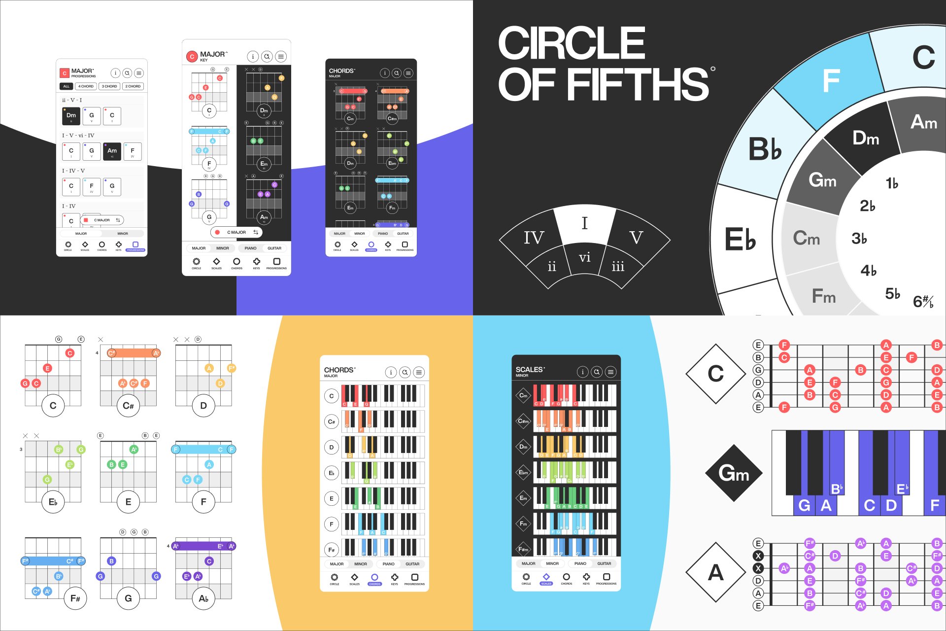
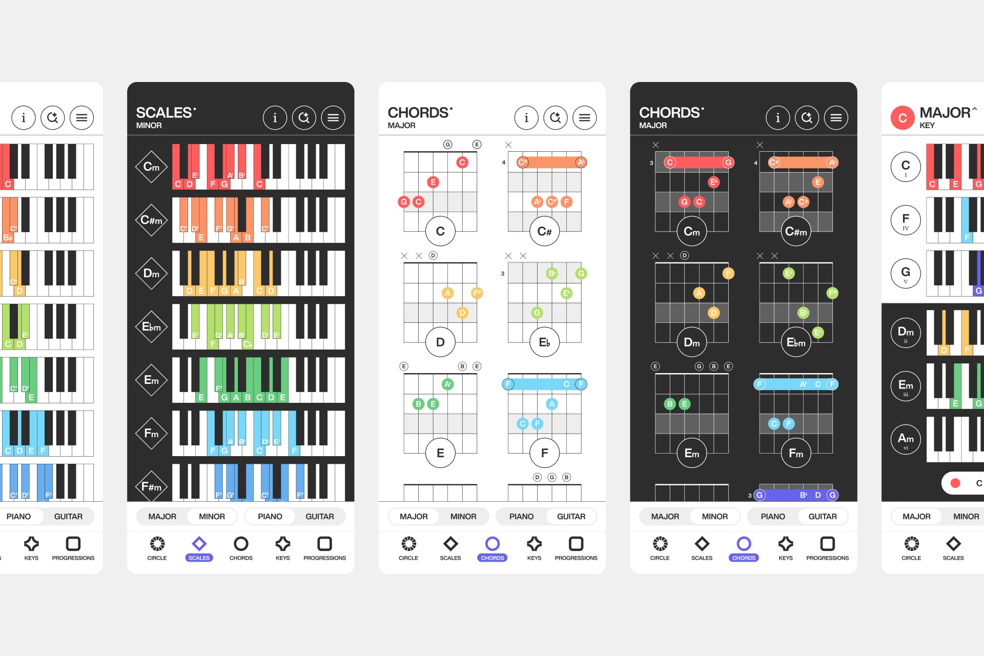
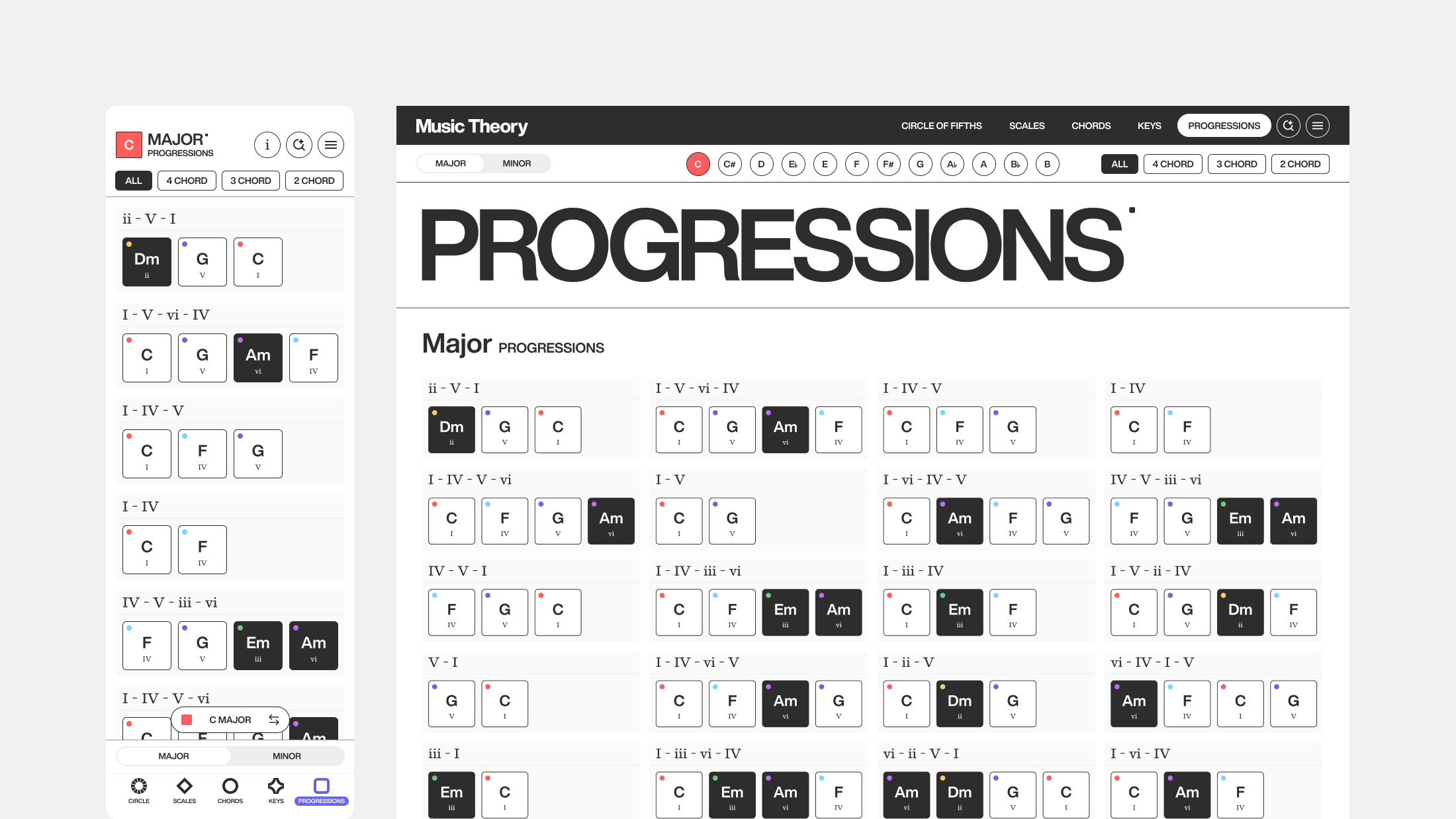
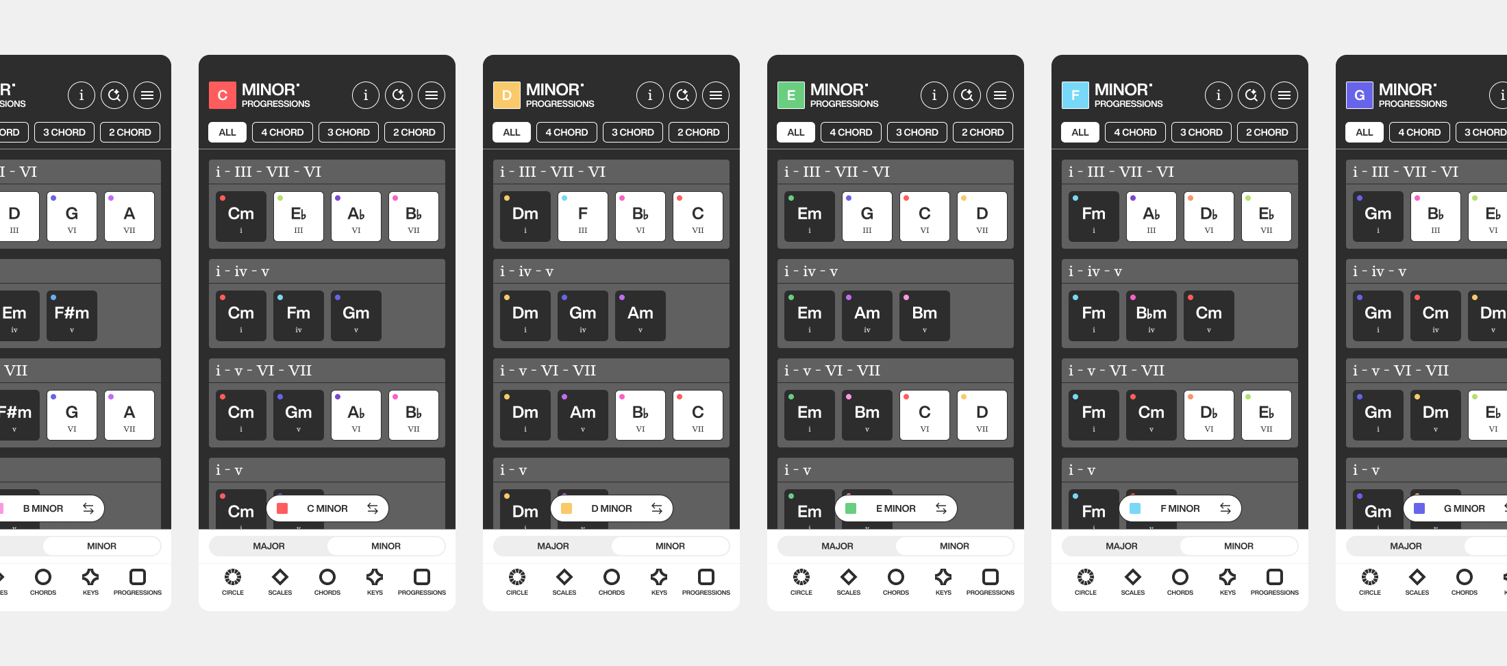
I assigned every note its own color. C is red, C# is orange, D is yellow, and so on for all 12 notes. These colors are applied across every chord, key, scale, and progression so musicians have a visual anchor that stays recognizable at a glance. I brought the same intent to the backgrounds. Major pages use white to reflect their brighter, happier sound and minor pages use black to match the more somber feeling they evoke. Every color meets WCAG 2.0 contrast standards so the system stays legible.
Navigating Key Relationships
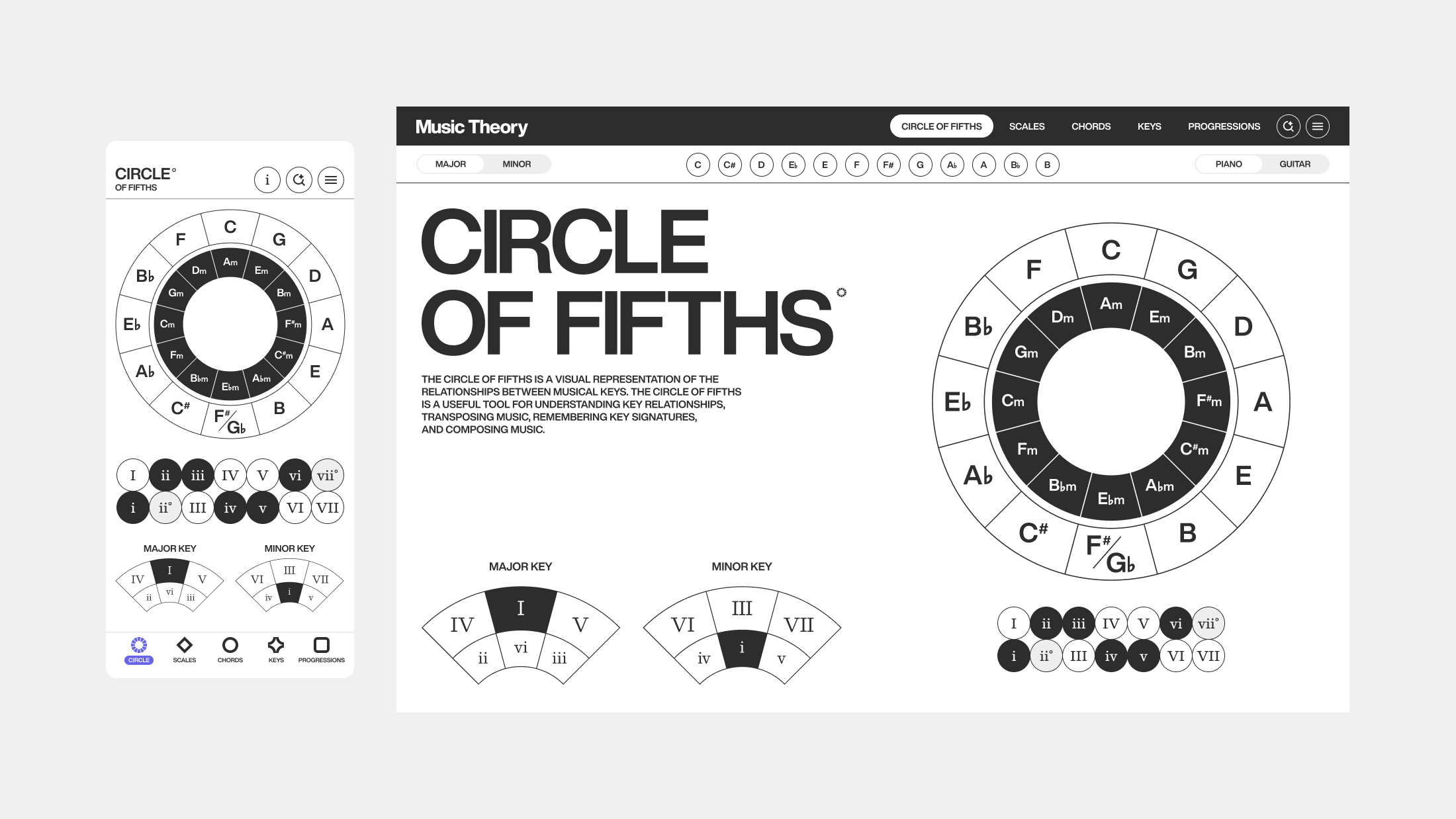
Circle Of Fifths
I designed the circle of fifths as the heart of the app, where every key is interactive and plays its chord sound on tap. Hearing each chord while navigating turns an abstract diagram into something musicians can explore by ear, not just read. It is a powerful tool for understanding the relationships between keys, chords, and scales in music theory. Using the major and minor legend, musicians can move through related keys and start writing their own progressions.
Guided Exploration
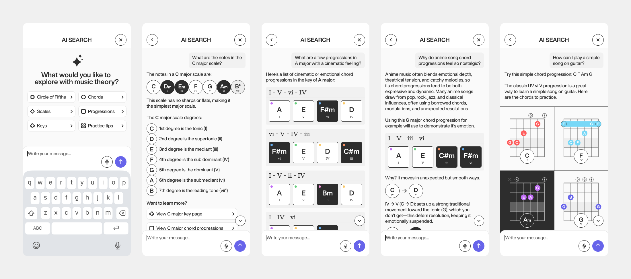
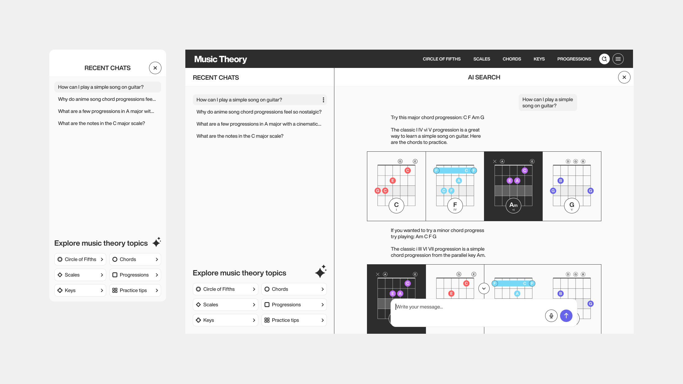
AI Driven Search
Search lets musicians ask questions or explore music theory concepts in their own words. It uses AI to pull from the app's content, recommending scales, chords, keys, and progressions while explaining the reasoning behind each topic. I used conversation design frameworks to shape how those responses are structured, so they build understanding in the moment rather than just referencing patterns or rules.
Cross Instrument Comparison
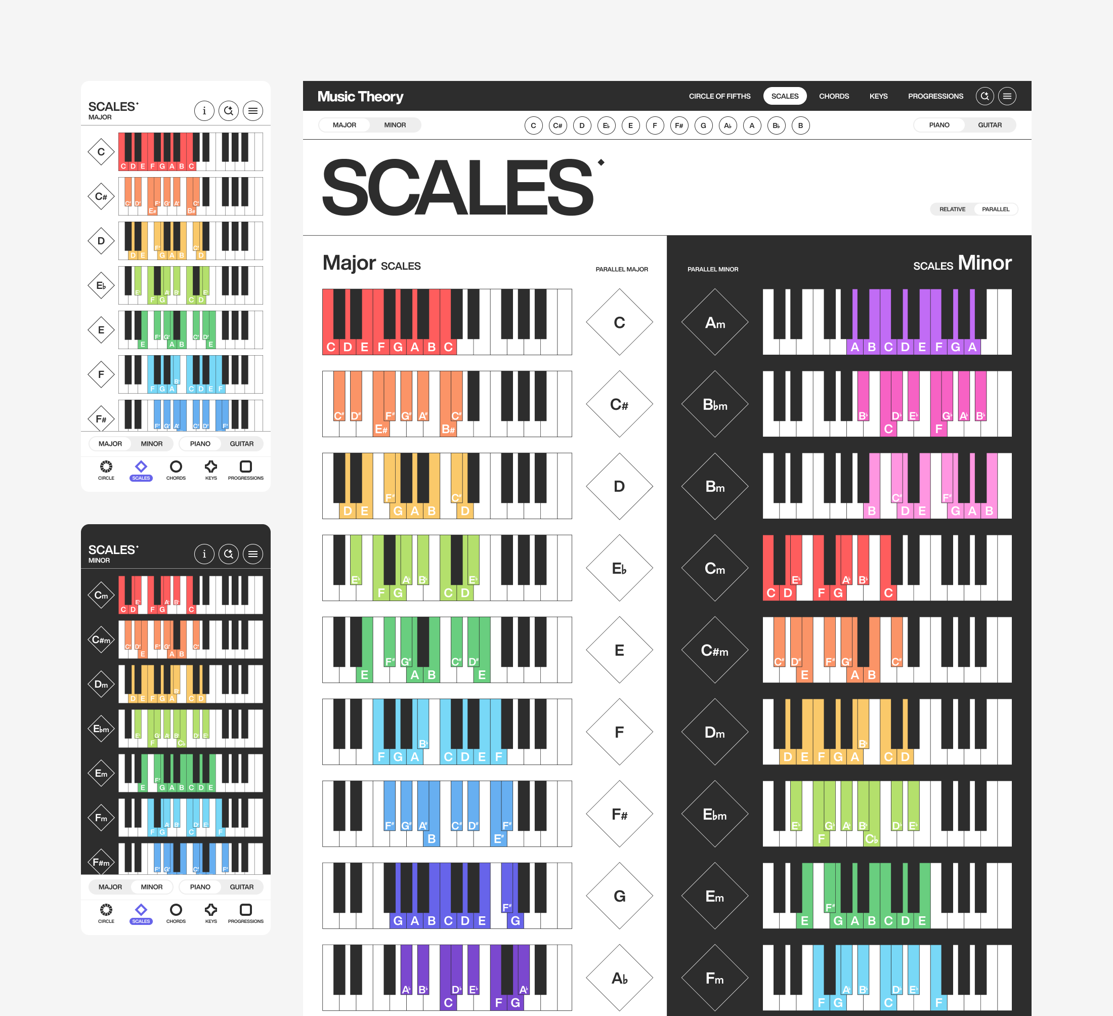
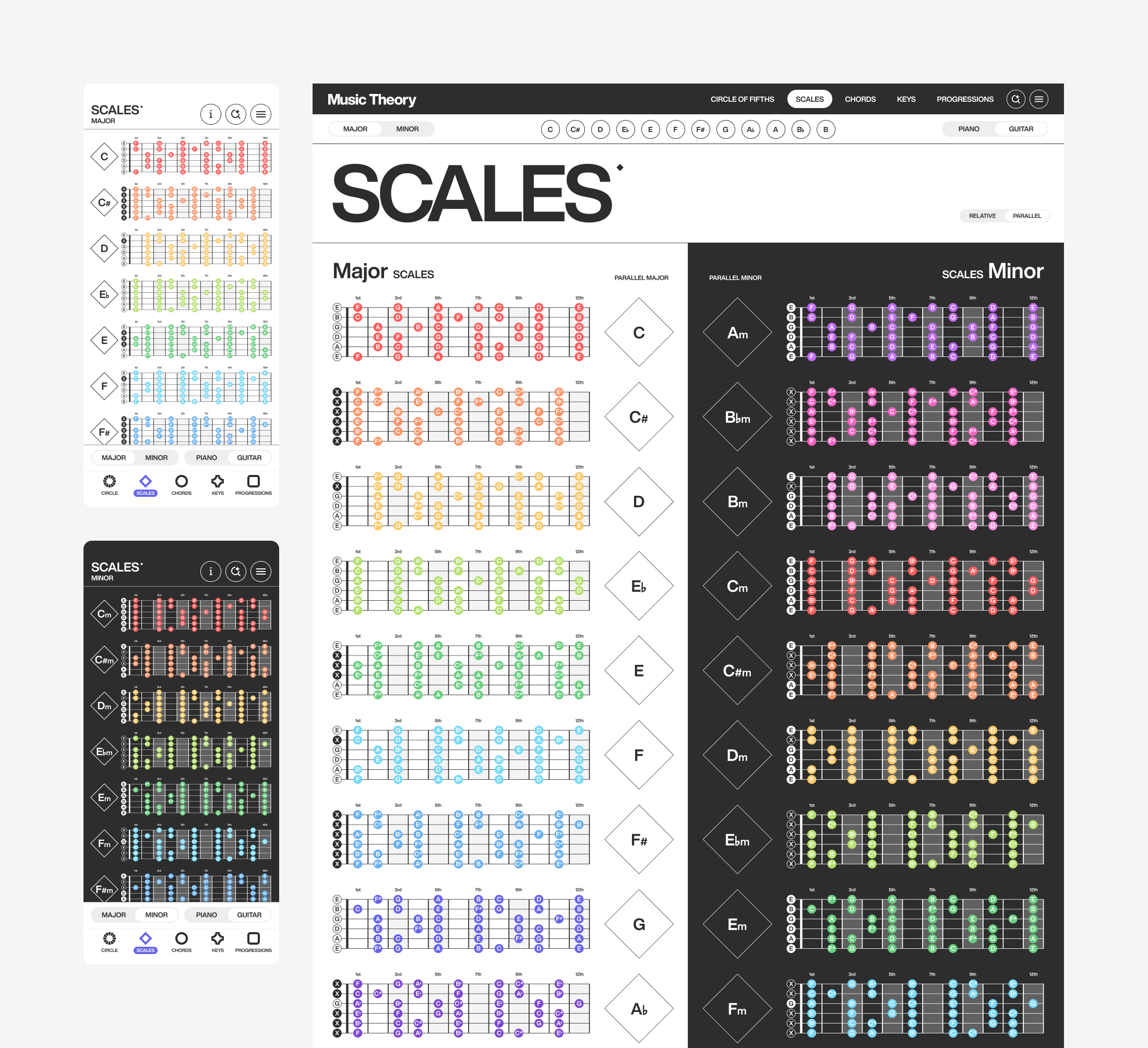
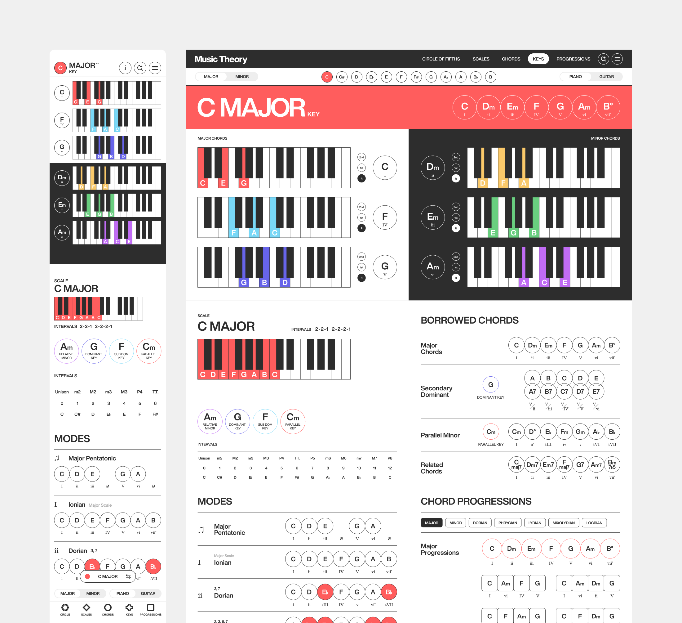
Scale Pages
I built scale pages to show every major and minor scale on both piano and guitar, with a toggle to switch instruments side by side. I added the ability to compare parallel and relative keys so musicians could see how major and minor relate rather than learning each scale in isolation.
The Building Blocks
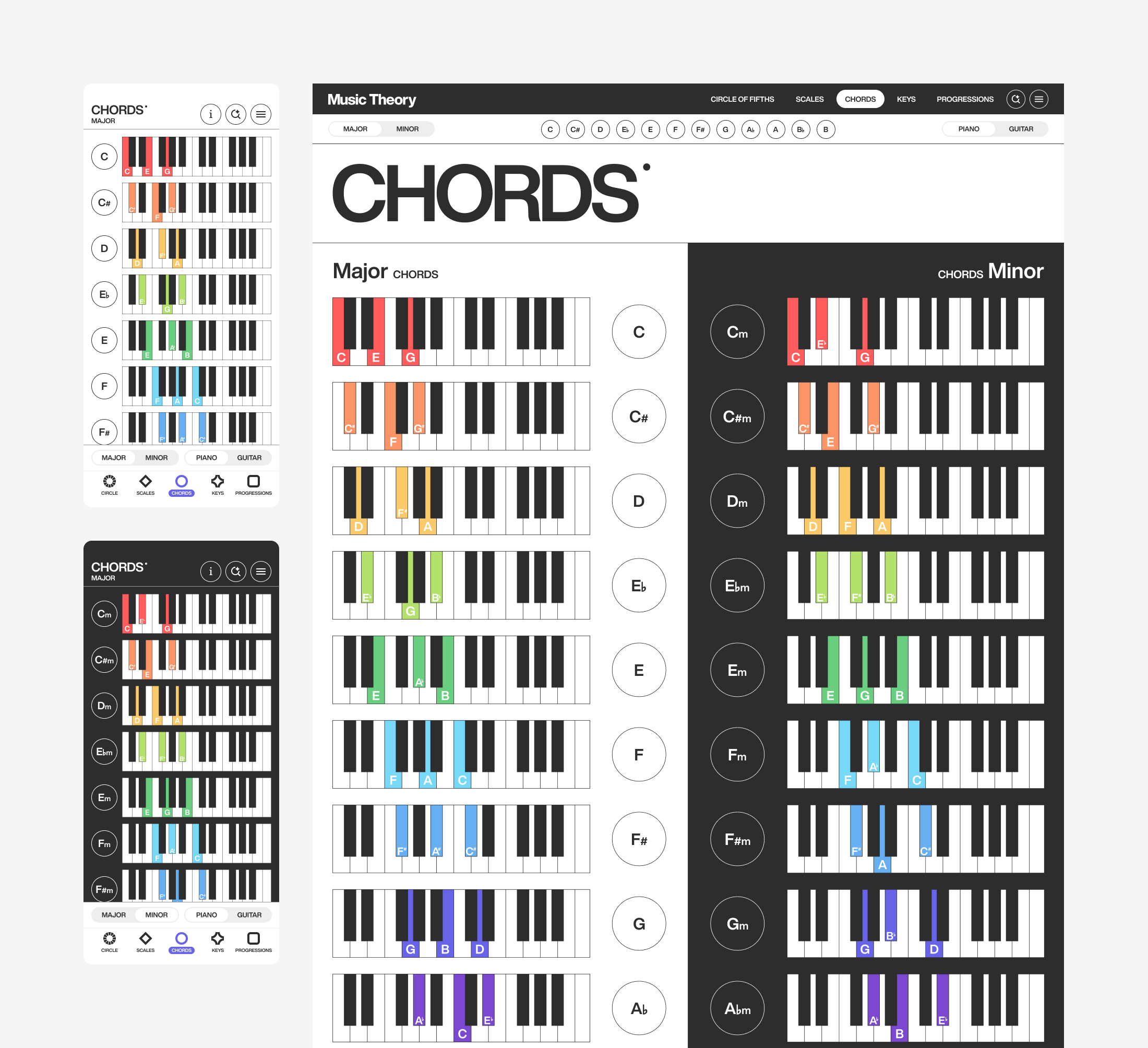
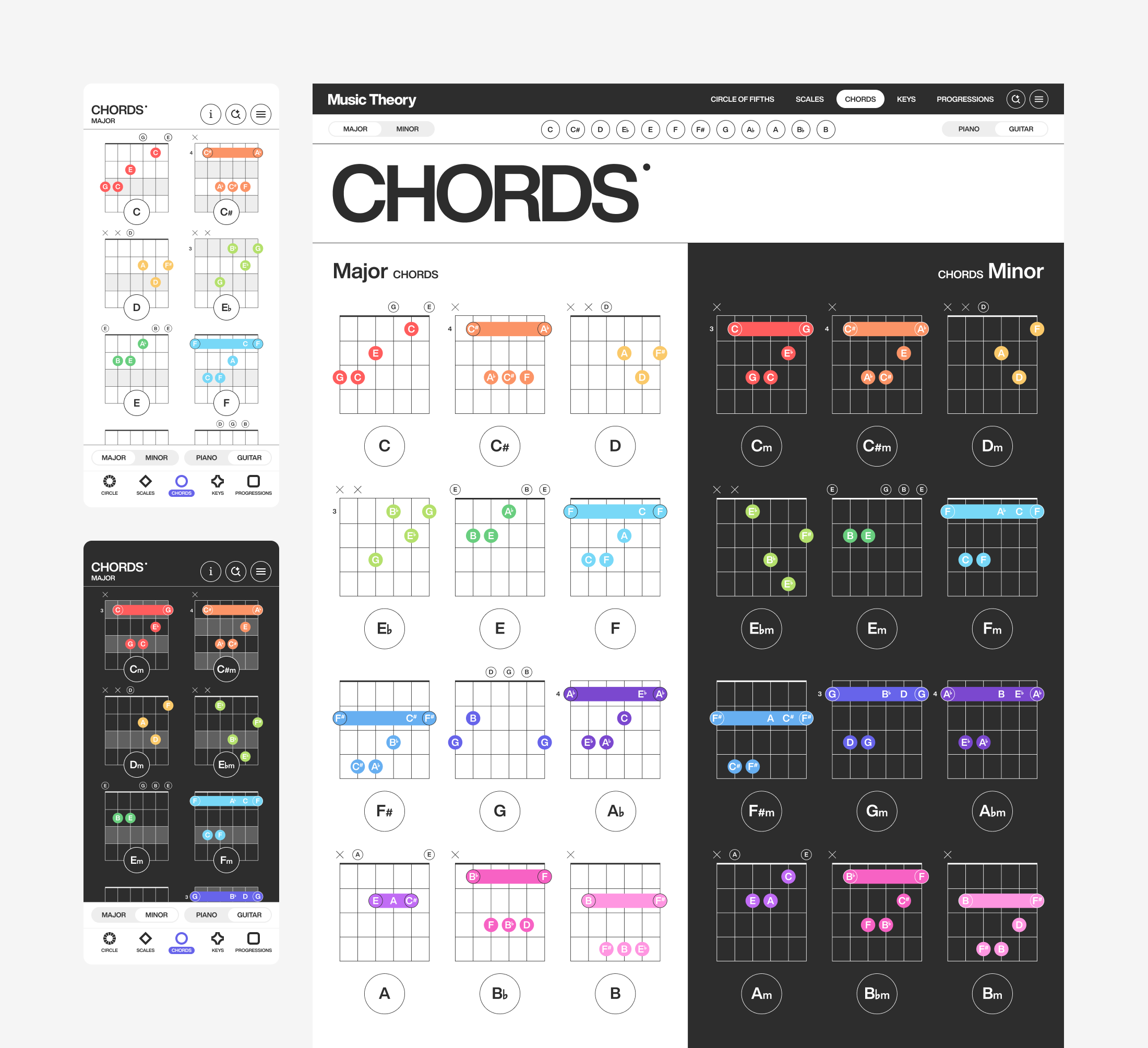
Chord Pages
Chord pages present the 24 basic major and minor chords in a simple, consistent form. I designed each chord to show exactly where to position your fingers on the guitar frets and piano keys. Two toggles let musicians switch between instruments and between major and minor chords, making it easy to compare how the same chord is played.
Beyond The Basics
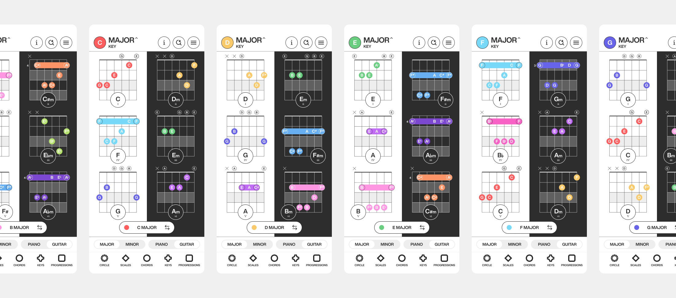
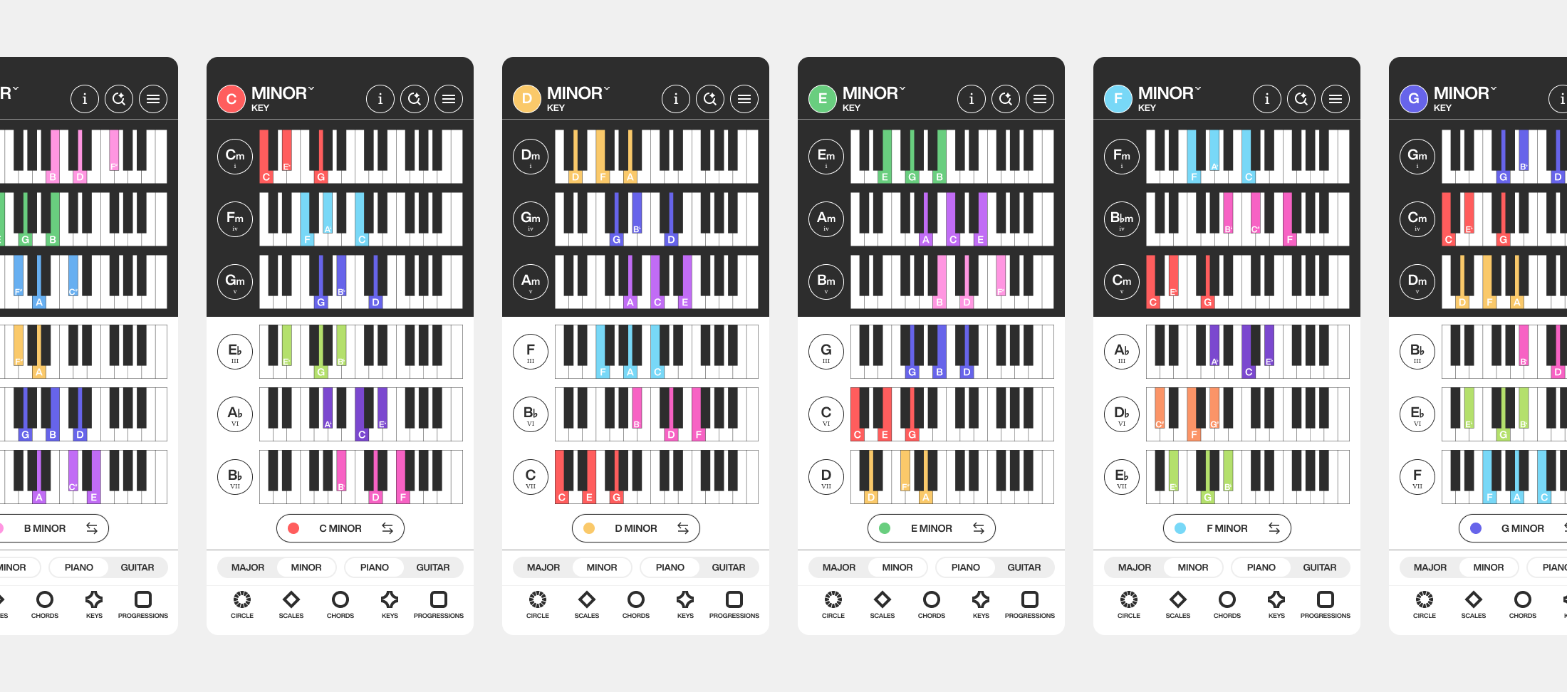
Key Pages
I designed key pages as a quick reference for finding the chords within any major or minor key. Swapping between keys is simple through the mobile dropdown or desktop sub navigation, giving quick visual access to any key. Each page also goes deeper than the basics, covering note intervals, scale modes, chord inversions, and borrowed chords for musicians ready to explore a key more fully.
Browse, Filter, Play
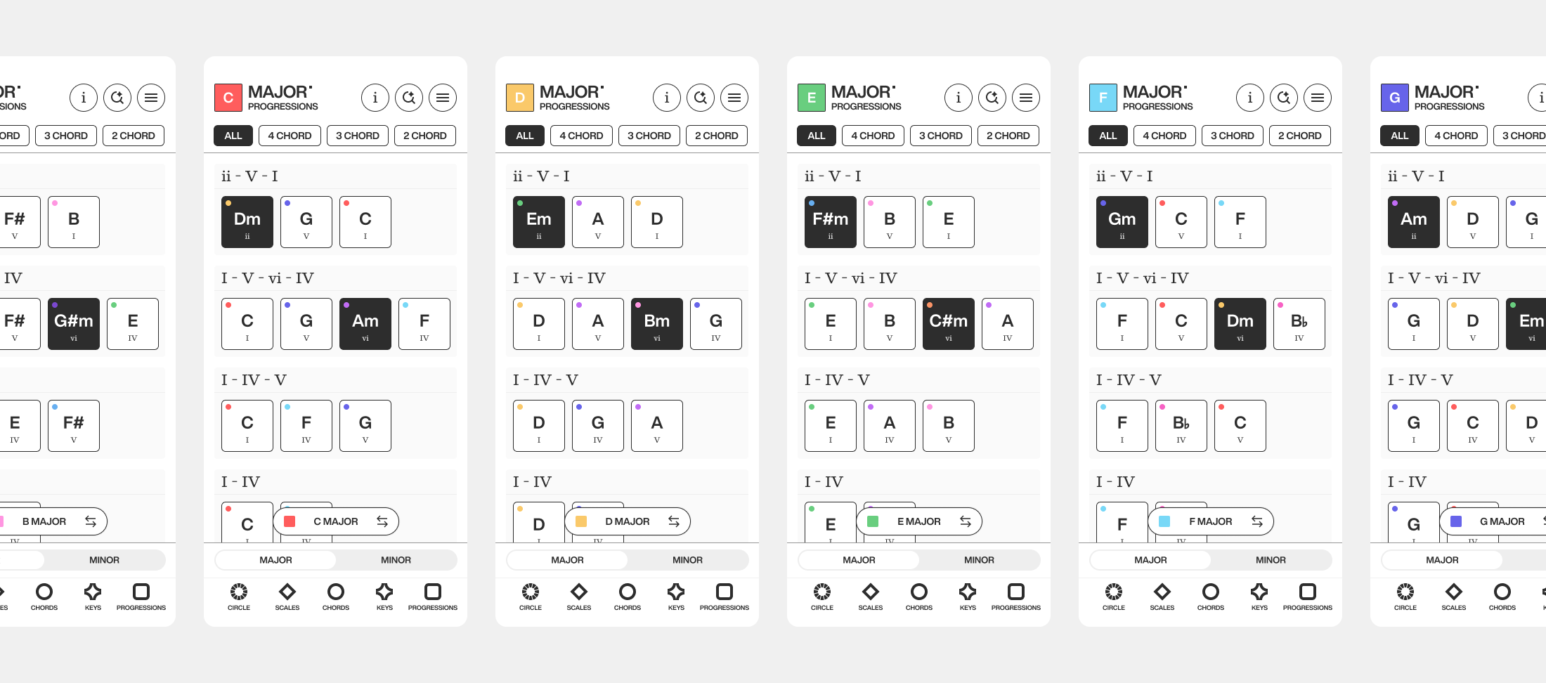
Progressions Pages
Progression pages are a library of chord progressions musicians can browse in one place, with filters to explore from simple to more complex progressions. Each chord plays its sound when selected, so a progression can be heard in the app before playing it live. Swapping between keys is the same consistent experience as the key pages.
Results
This product started with a problem I kept running into, a struggle to understand music theory concepts from a variety of resources. I saw a need for a product experience that brought those concepts together in one solution. By grounding the design in a consistent color system, interactive sound, and consistent UX patterns, I created a cohesive experience where musicians can explore basic music theory concepts all in one place. After testing and iterating the product with music educators, they validated its value by sharing it with their students. The app is now in development, a sign that thoughtful design turned a common problem into a resource musicians find genuinely valuable.
Challenges
Representing two instruments equally. Piano and guitar show the same chord or scale in completely different ways, one as keys, one as frets. The challenge was designing a system where musicians could compare both without one instrument feeling like an afterthought, which led to the side-by-side toggle approach.
Building one consistent language across many concepts. Chords, keys, scales, and progressions each have their own logic, but they needed to feel like one product. Designing a color system and navigation pattern that held up across all of them, rather than designing each page in isolation, was a core challenge.
Lessons Learned
Validation from real users changes the work. Seeing two music educators want to share the app shifted it from a personal project to something with real value, and reframed how seriously I approached the remaining design decisions.
Simplicity does the heavy lifting. The clearest version of each design almost always resonated more than the more detailed one. Keeping each page clean and uncluttered helped musicians focus on learning rather than the interface.
Future Recommendations
Keep iterating through usability testing. The product improves most when watching real musicians provide feedback. Continued testing will surface friction points I can't predict on my own and keep the design grounded in how people actually use it.
Expand beyond piano and guitar. The instrument toggle was built to compare two instruments, but the same system could extend to others, making the app adaptable to a wider range of instruments.
Deepen the learning paths. The content currently covers the basics well, with some advanced topics layered in. A natural next step is guiding musicians through progressive learning paths so the app provides value to all musical knowledge levels.
Build on the AI search foundation. The conversational search is a strong base for more personalized learning, like suggesting what to practice next based on what a musician is exploring, which could make the experience adaptive over time.