Designing The
Cross-Brand Shopping Experience For KAO
Building shared cart functionality across six beauty brands to enable cross-brand shopping and reduce checkout abandonment.
Scope
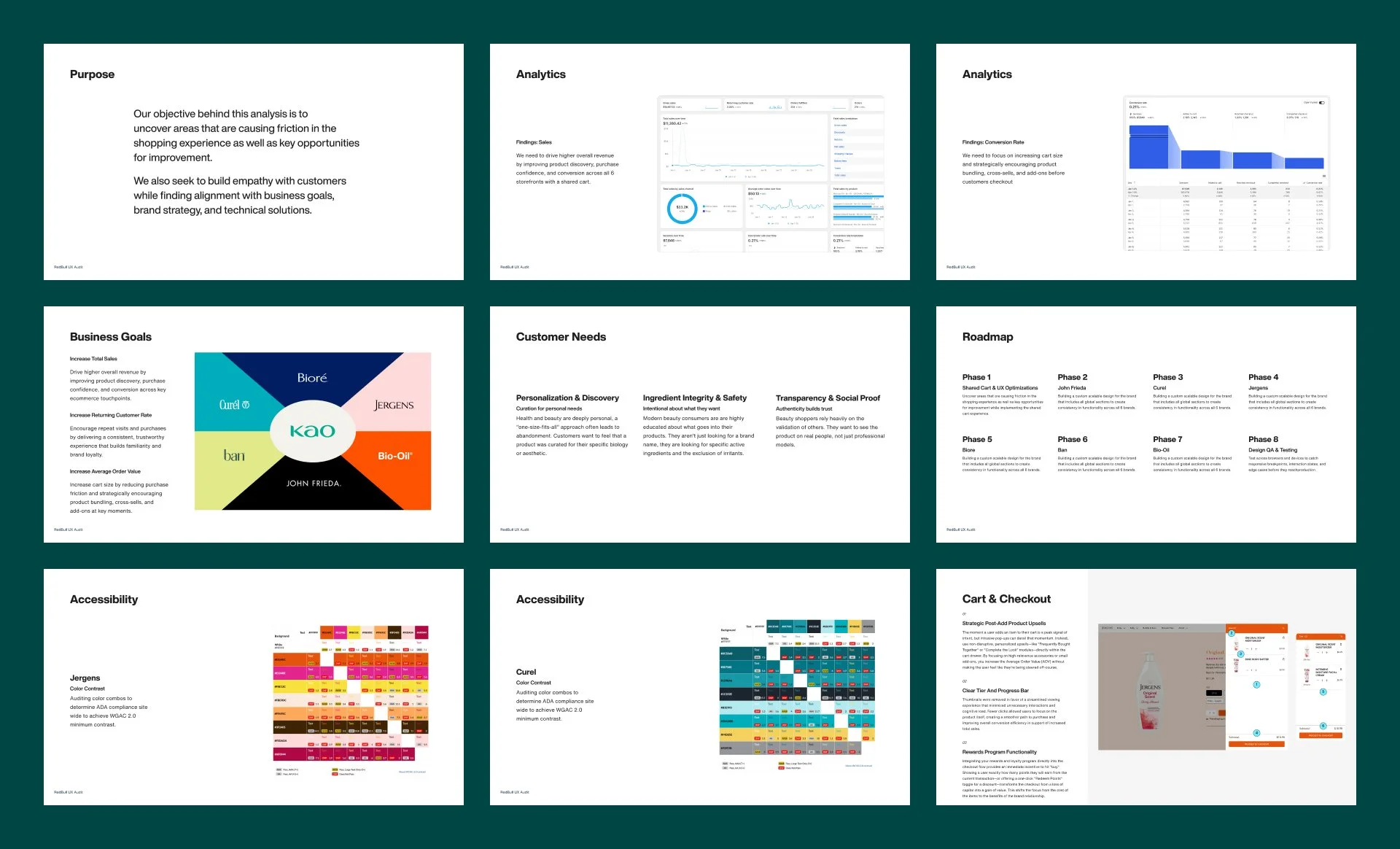
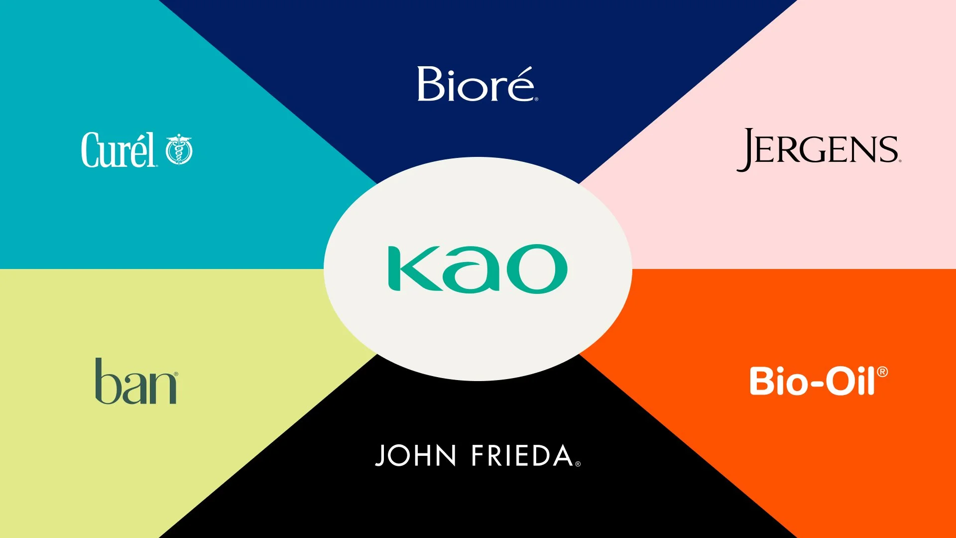
I led the redesign of KAO's shopping experience across six beauty brands. I partnered with our analytics team to uncover how these brands could unify, then scaled the design systems behind a shared cart while maintaining each brand's identity.
Role
Timeline
Product Designer
12 Months
Contributions
UX and Visual Design
Design System Components
A/B Testing and Accessibility
Impact
53% increase in total sales
44% increase in reached checkout
75% increase in completed checkout
13% increase in conversion rate
Problem
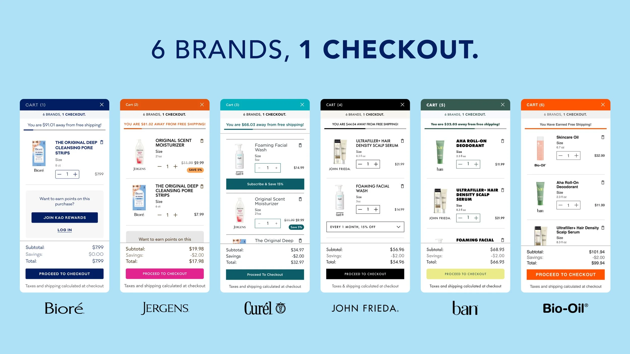
Multiple Checkouts
Drove Cart Abandonment
Analytics and user research uncovered a clear gap. Customers wanted to shop across KAO's brands in one transaction, but separate storefronts made it impossible. They had to build multiple carts and check out multiple times, driving abandonment.
Solution
A Unified Cross-Brand Experience
I designed a shared cart for customers to shop across all six brands and complete one checkout, regardless of where they started. One path from discovery to purchase replaced the separate transactions.
A Shared Cart Built For One Checkout
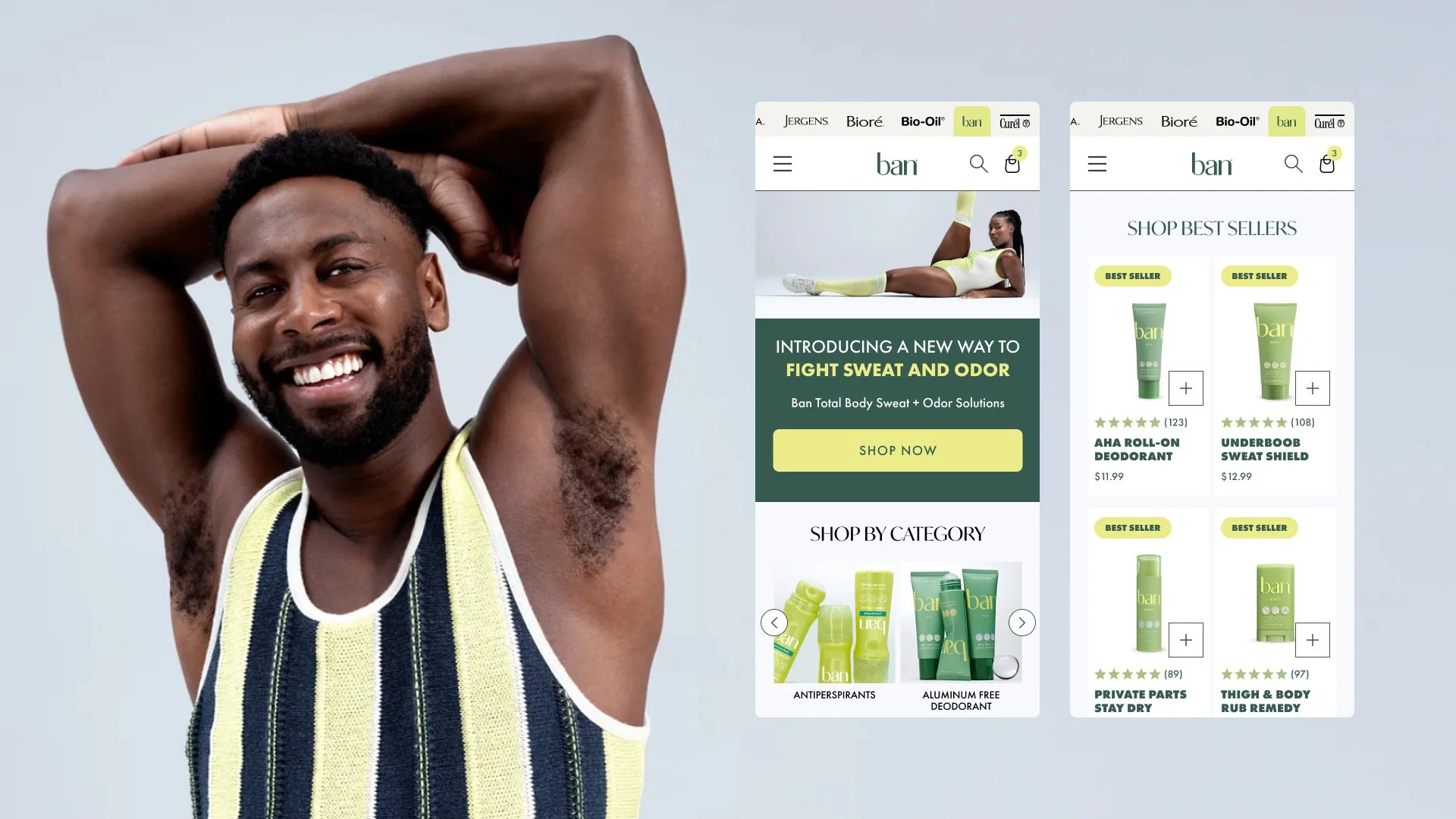
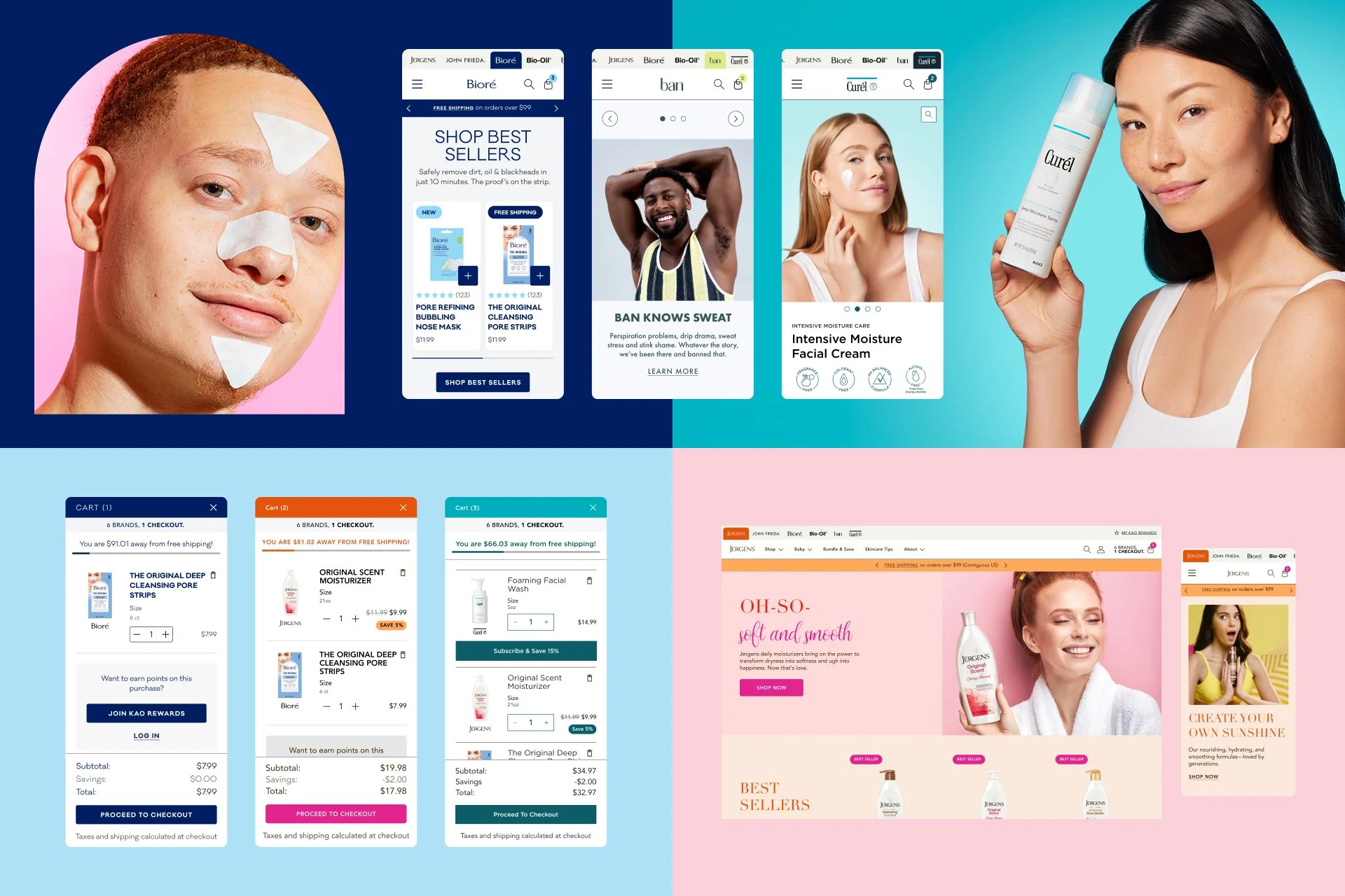
Designed a shared cart that allows customers move between storefronts while maintaining one checkout. Added a brand badge to every product in the mini cart for customers to distinguish between brands.
Increased Product Discovery With Branded Tab Navigation
I designed a persistent tabbed navigation that let customers shop any storefront from anywhere, giving them a path to explore all six brands and add more products to their cart.
Unified By Design, Differentiated By Brand
Every brand had different needs, from deep catalogs to subscription flows. I designed navigation, listing, and detail pages for each brand that respected those differences while staying rooted in the shared system.
Components And Accessibility Built For Scale
Built six brand-specific design systems on a shared foundation, giving engineers one consistent structure to build from. Met WCAG 2.0 across all shopping flows so accessibility was built into the experience.
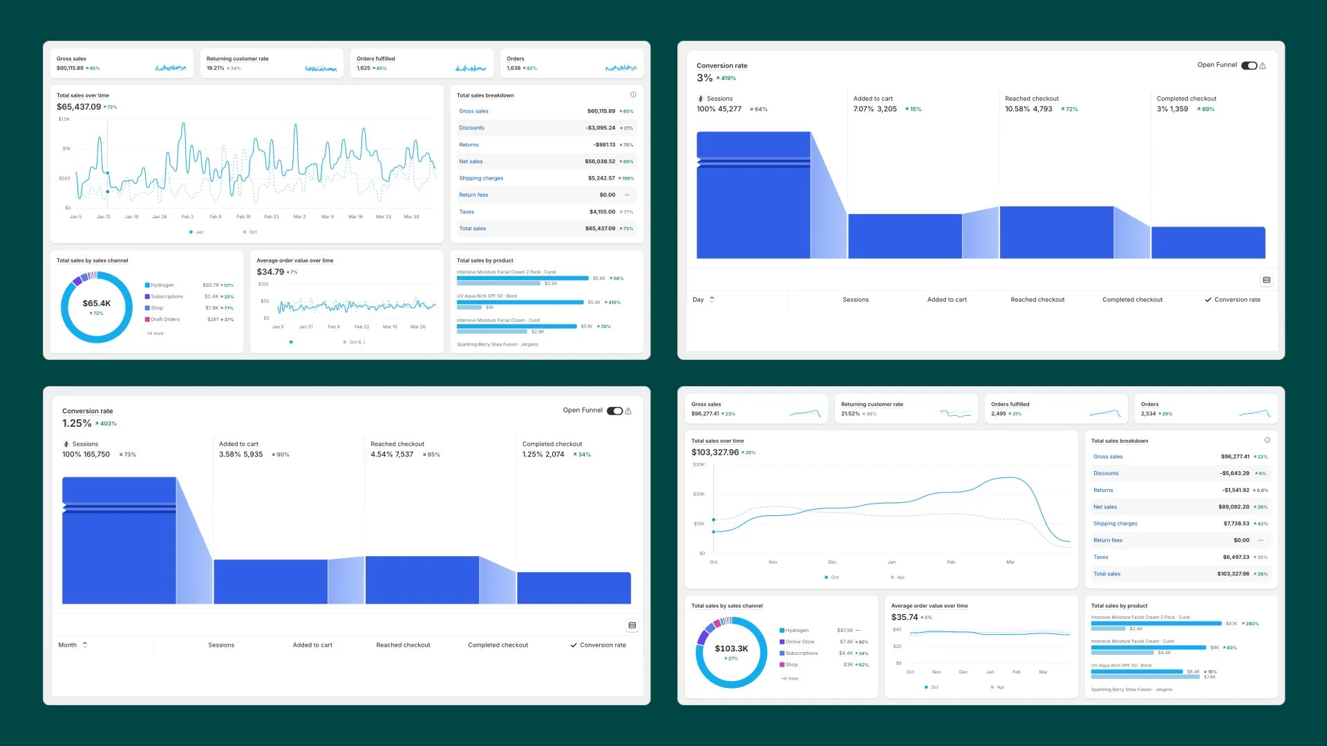
Performance Testing
Performance testing tracked conversion rate, average order value, and returning customers across the unified experience. Every metric improved, confirming the shared checkout addressed the abandonment problem.
Impact
Unified Checkout, Higher Conversions, Huge Sales
53% increase in total sales
44% increase in reached checkout
75% increase in completed checkout
13% increase in conversion rate
Conclusion
Exceeding Expectations
Earning A Retainer
Unifying six fragmented storefronts into a single shared cart grew KAO's checkout completion from 6% to 33%, beyond what the client expected. The results earned an ongoing retainer to keep building on the KAO design system foundation.