Retainer
Redesigning The RedBull Shopping Experience
Identifying and solving friction points that were hurting conversions and customer retention.
Live Site redbullshopus.com
Designed at The Stable, Part of Accenture Song
Services
UX Audit
Competitive Analysis
Wireframes
Interactive Prototypes
Design System Components
Design QA
ADA Compliance
A/B Testing
Team
Product Designer — TJ Hari
Brand Strategist — Kristen S.
Engineer — Owen D.
Tech Lead — Romain C.
Delivery Lead — Brayden T.
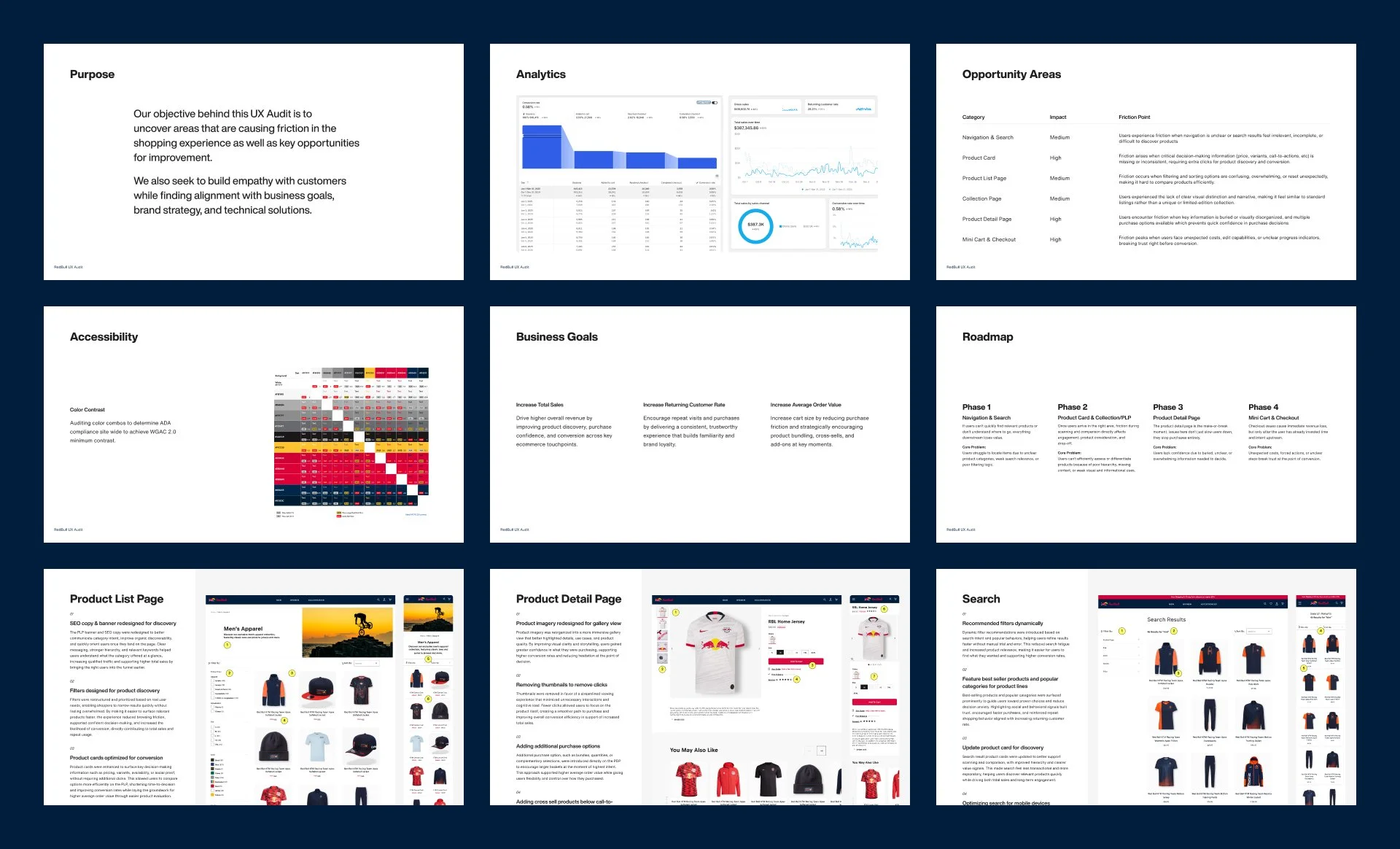
Overview
Red Bull's US online store includes sports team apparel and accessories, with quarterly releases of their limited edition collections. The site was underperforming their global store, with higher drop-off rates on product pages and weak product discovery. The team suspected UX issues but couldn't pinpoint the root causes, so I was brought in to identify which pain points were driving the performance gap.
I partnered with Red Bull's strategy and global teams to diagnose the problem through research and analytics. We identified critical friction points in product discovery and the shopping journey. I redesigned key components in the shopping experience to increase sales, boost average order value, and improve customer retention.
My Role
I was responsible for redesigning the Red Bull US store's shopping experience to close the performance gap with their global site.
I led the UX design for key touchpoints throughout the shopping journey, creating wireframes and prototypes based on user research and analytics over a six-month engagement. I collaborated with product managers, engineers, and strategists to prioritize high-impact optimizations despite timeline and budget constraints. My challenge was balancing visual brand consistency with strategic conversion goals, using A/B testing and iteration to validate design decisions.
Problem
Understanding The Problem
I conducted a site-wide UX audit alongside the strategy team's analytics and identified six critical areas underperforming compared to the global site. Navigation, search, filters, product cards, product detail pages, and cart all had significantly higher drop-off rates. Each weakness in the conversion funnel fed into the next, creating a broken experience that hurt sales.
Approach
Creating The Product Vision
The audit gave a clear picture of what needed to change. I created a product vision for the redesigned shopping experience. I mapped out the ideal customer journey from discovery to purchase, supported by wireframes and high-fidelity prototypes to communicate the direction clearly.
I collaborated with the RedBull team to align on priorities and establish a rollout plan for design, testing, and deployment. A/B testing was built into the strategy from the start to validate changes against real user behavior, and all designs were held to ADA compliance standards throughout.
Designing The Solution
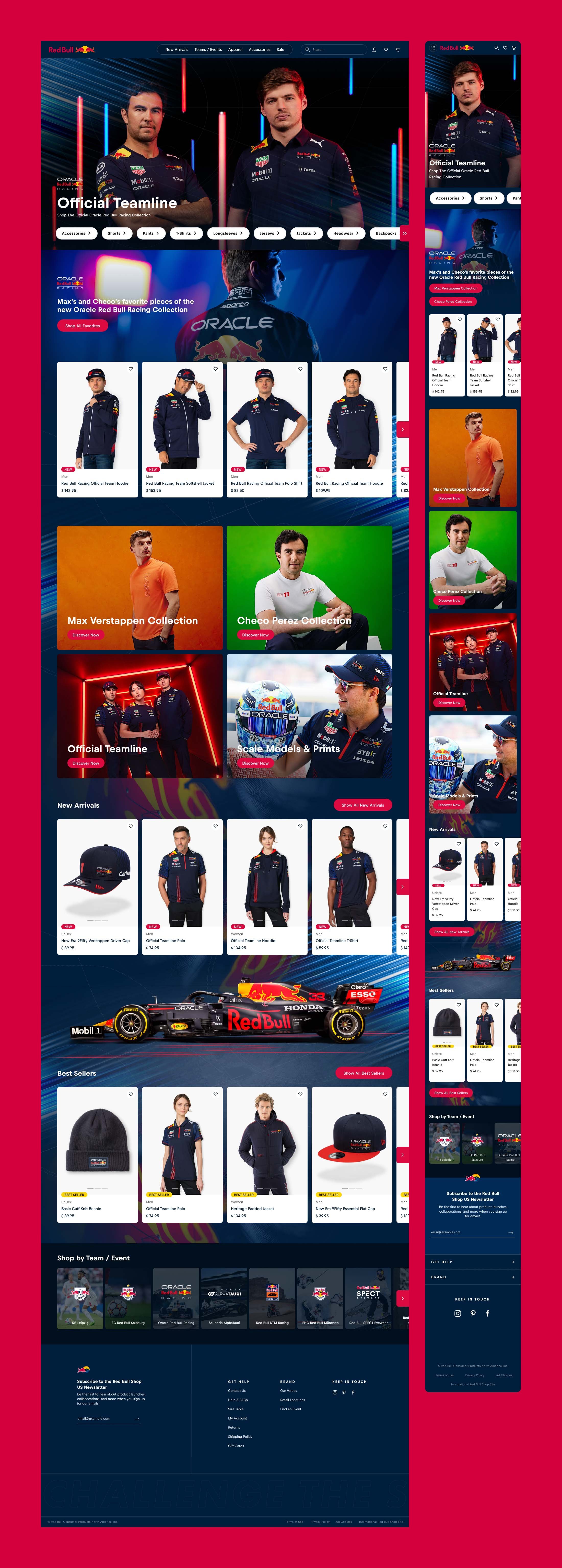
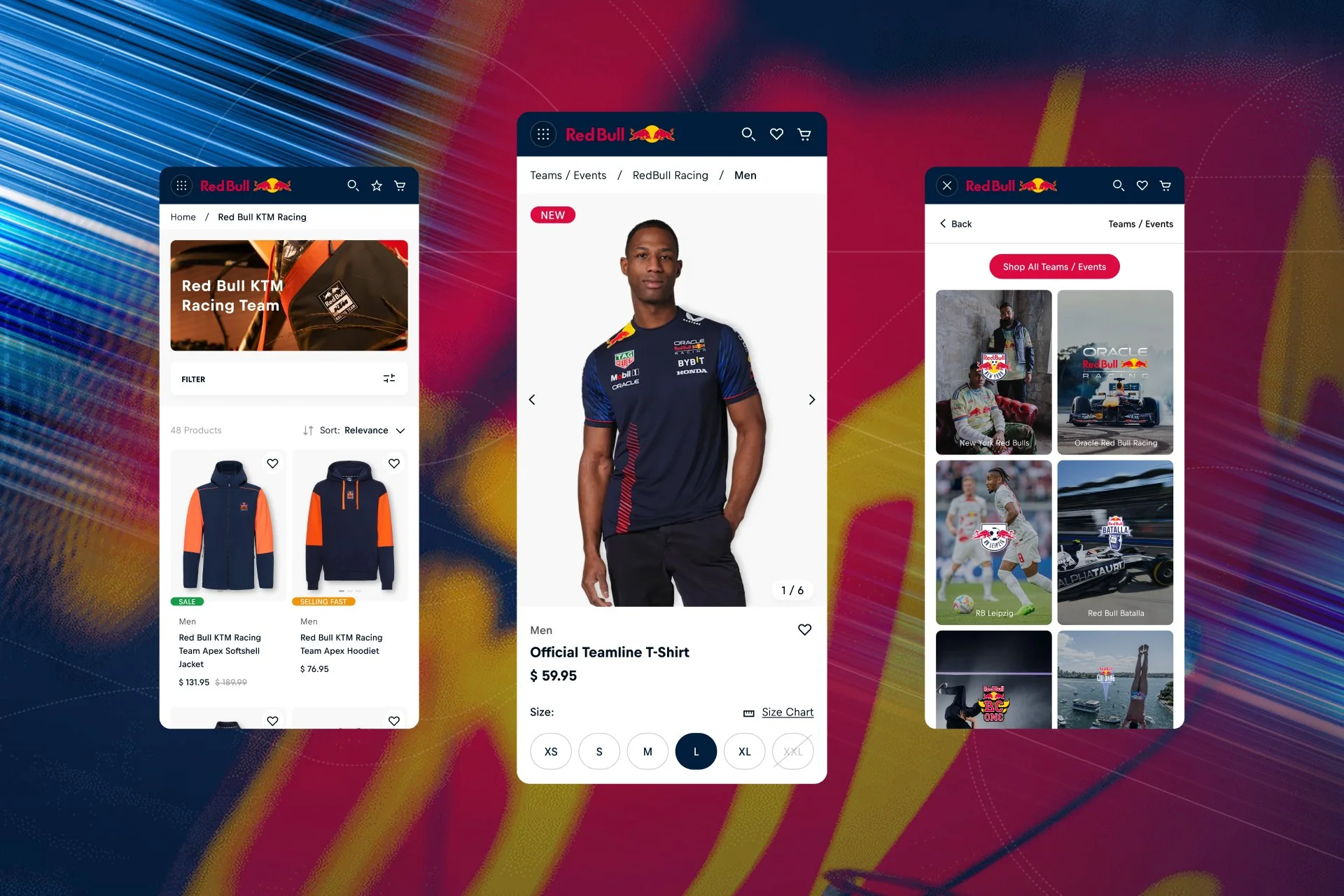
Product List Page
The product list page filters were not designed to help users narrow down their search, leaving them faced with an overwhelming wall of products. I redesigned the filter system to be more intuitive and accurate, organizing them by team, product type, size, and price to match how fans naturally shop. These changes reduced friction in the browsing experience, making product discovery faster and helping more users convert to customers.
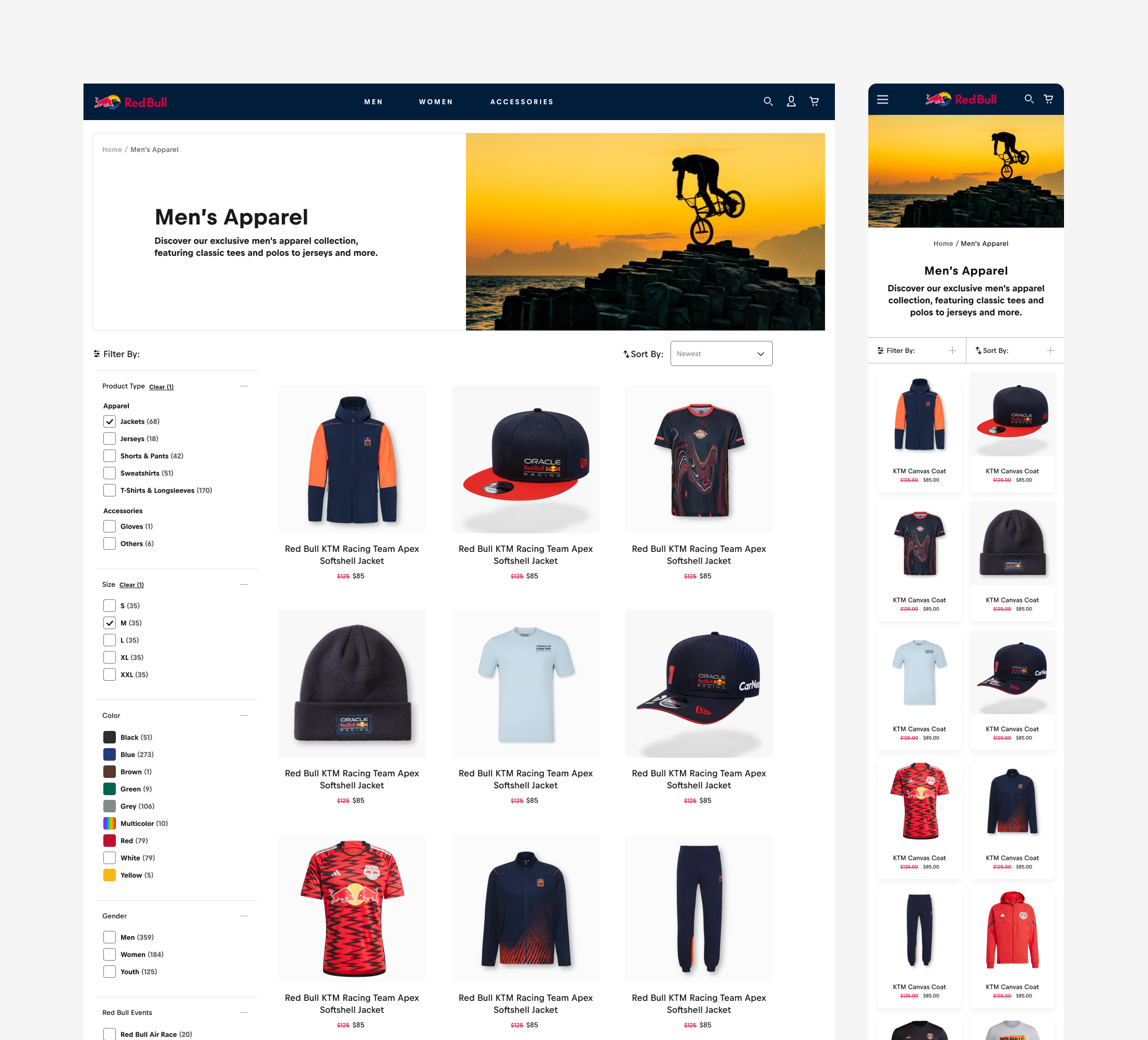
Before

After
Designing The Solution
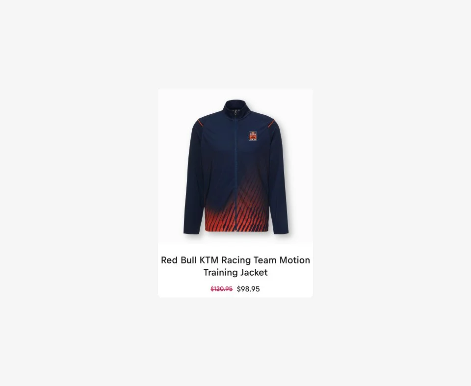
Product Card
Product cards across the site weren't providing users with enough information at a glance, which meant they had to click into every product to browse details and add to cart. I added quick-add functionality so users could add items directly from any product card. Image carousel functionality let users browse multiple angles without clicking through. I also added wishlist capability, badge colors, and category labels for stronger visual hierarchy and context. All together, these changes streamlined the purchase path, letting new and returning users make faster decisions and complete more purchases without leaving the browsing experience.
Before
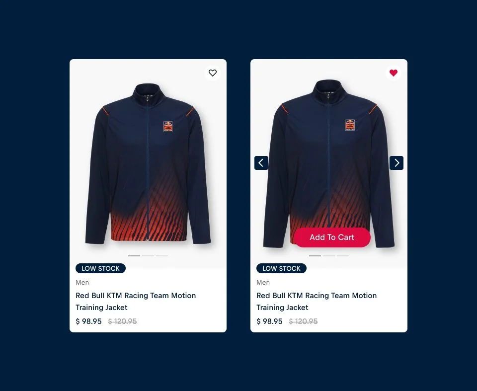
After
Designing The Solution
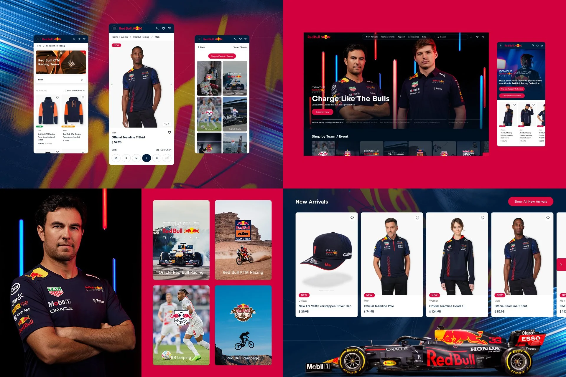
Collection Page
Product collection pages had higher drop-off rates than the global site, signaling that something in the browsing experience was losing users before they could convert. The pages felt too generic to match the passion fans brought when shopping for their favorite team's gear. I redesigned each collection page to surface bestsellers and new arrivals in a way that felt intentional and team-specific. I also designed custom branded visual elements for each team that created a tailored feel for each product line, making fans feel like the experience was built specifically for them.
Designing The Solution
Product Detail Page
The product cards needed to communicate more at a glance without pulling users away from browsing. I added quick-add functionality, an image carousel, wishlist capability, badge colors, and category labels. Together, these changes let users make faster purchasing decisions and add products without disrupting their flow through the site.
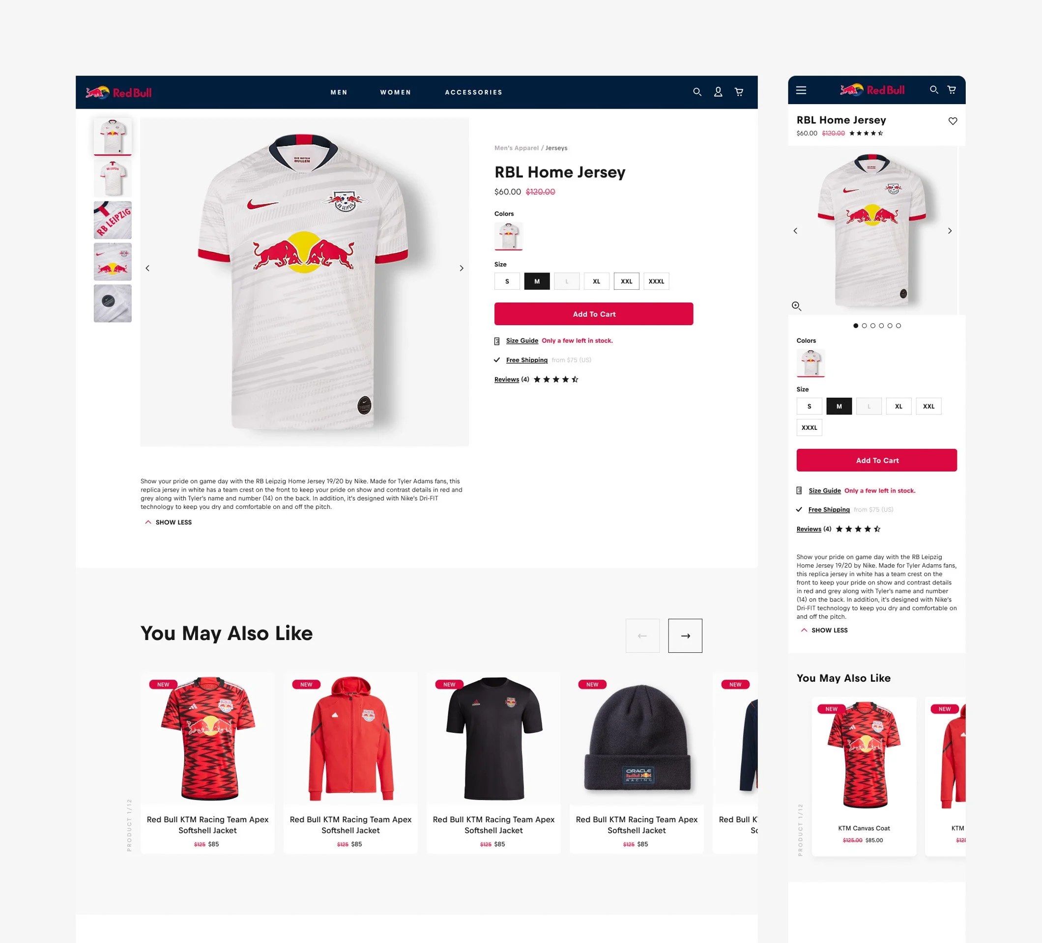
Before

After
Designing The Solution
Navigation & Search
Product discovery was the first place users were struggling. Using search analytics, I prioritized top search queries and best-selling products to restructure the information architecture. This made it easier for users to find products based on their favorite teams and categories, reducing friction at the very start of the shopping journey and encouraging users to come back.
Designing The Solution
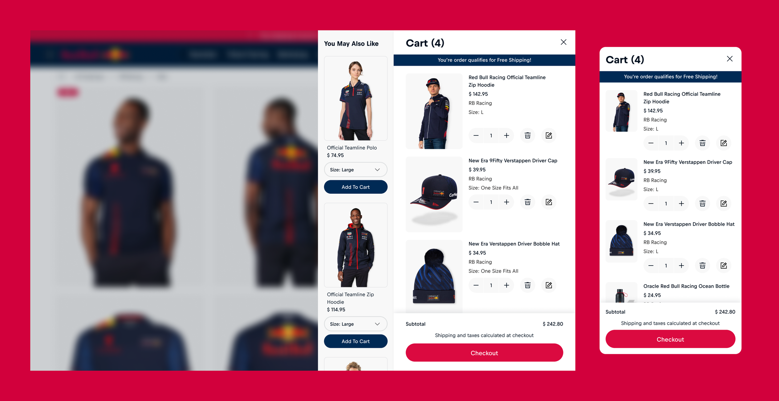
Mini Cart & Cart
The mini cart and cart became key opportunities to increase average order value. I designed product upsells using data to identify which product categories worked best together, strategically encouraging users to add more items. Free shipping thresholds and promotional messaging gave users a clear incentive to add more. I also added an edit feature so users could swap between product SKUs without leaving the cart, reducing friction at the final stage. These optimizations worked together to boost order value while keeping the path to purchase smooth.
Designing The Solution
Design System & ADA Compliance
I redesigned the design system to align with RedBull's global brand while incorporating optimized components that addressed gaps in the global site. This maintained visual consistency while giving the US store custom team collection pages and improved site wide functionality.
Also ensured the entire site met WCAG 2.0 accessibility standards. This included proper color contrast, keyboard navigation, and screen reader compatibility across all shopping flows. By designing for accessibility from the start, we expanded the potential customer base and removed barriers that could prevent conversions.
Release And Evolve
A/B Testing
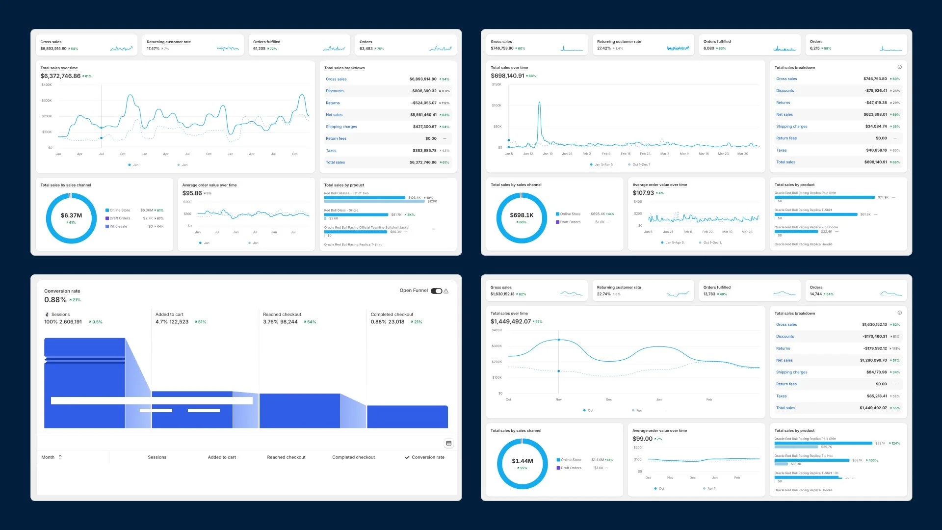
We deployed the redesign in phases, A/B testing each major component against the existing shopping experience. We tracked performance against conversion rate, average order value, and returning customer metrics, making refinements to micro interactions between phases based on user behavior patterns. Early testing showed positive movement toward our goals with no decline in baseline conversions, which validated the full rollout.
Release And Evolve
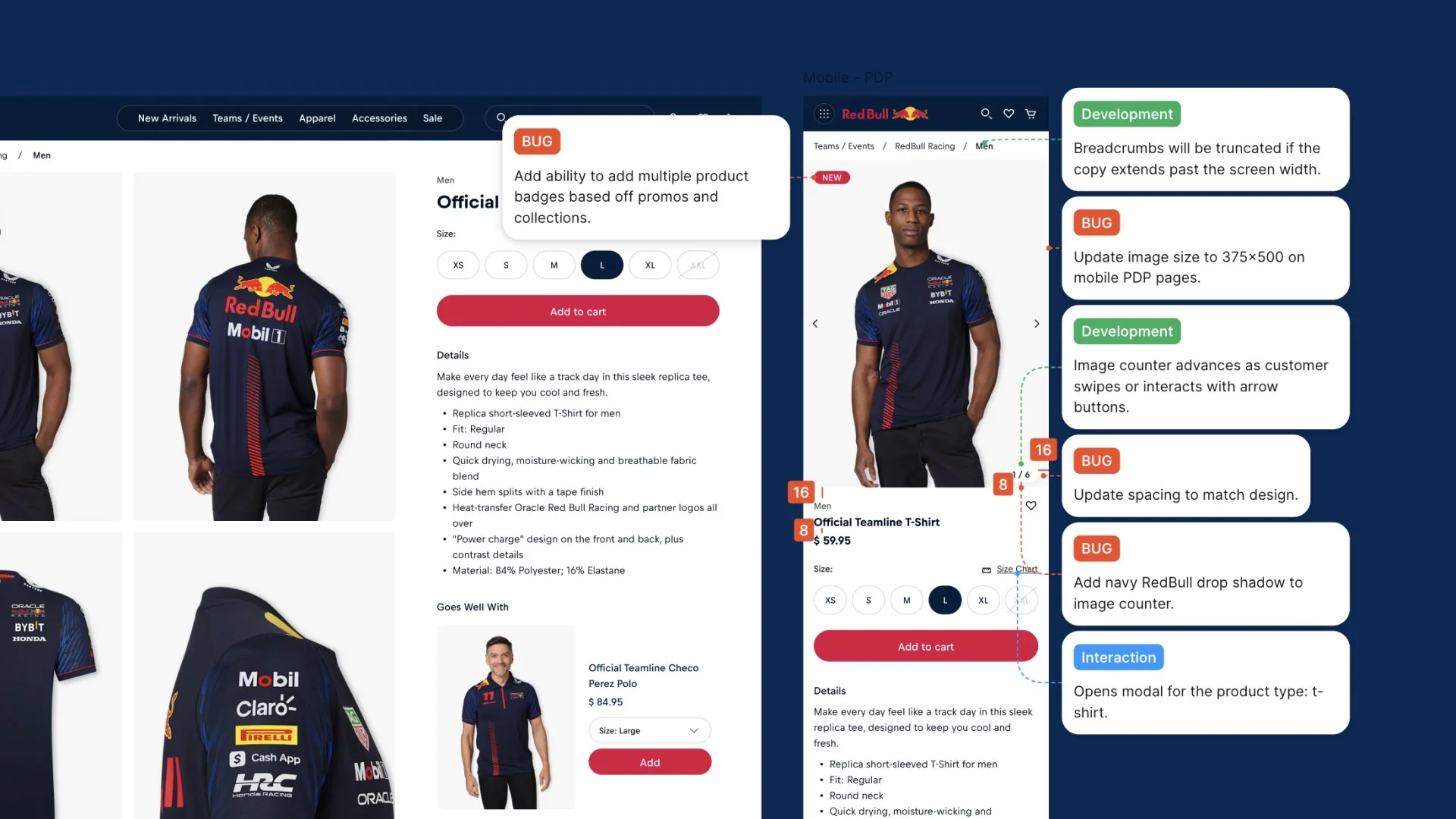
Annotations & Design QA
I created detailed design annotations and specifications that reduced ambiguity for engineers and minimized bugs during development. During design QA, I tested across browsers and devices to catch responsive breakpoints, interaction states, and edge cases before they reached production. This collaborative QA process ensured the final experience matched the design vision while enabling a faster, smoother rollout with fewer revision cycles.
Results
Metrics
37% increase in returning customer rate
49% increase in total sales
8% increase in average order value
Conclusion
By solving friction areas across the shopping journey, the RedBull US store exceeded expectations. The success led RedBull's global team to incorporate key optimizations into their own storefront, proving that thoughtful, data-driven design improvements can scale beyond their original scope.
Challenges
Aligning diverse stakeholder priorities around a unified product vision everyone could support.
Ensuring the design was responsive and worked seamlessly across breakpoints.
Lessons Learned
Multiple friction points don't exist in isolation, they compound to hurt conversion. Fixing them holistically had a greater impact than tackling each separately.
Phased A/B testing validated our design decisions and revealed user behaviors that helped us refine micro-interactions.
Future Recommendations
Continuous Testing & Iteration
Establish an ongoing testing framework for new user friction points and unexpected edge cases as behavior evolves, ensuring the site adapts as product lines and traffic patterns change.
Optimize For Mobile Behaviors
With mobile traffic high for RedBull's audience, conduct mobile-specific research to identify unique friction points and design mobile-first features (swipe gestures, simplified navigation).
Leverage Purchase Data
Use historical purchase data and cart combinations to refine product upsells beyond category matching by pairing products that customers actually purchase together.
Scale The Component Library
Expand the design system to support additional product categories and seasonal campaigns, maintaining consistency as RedBull's catalog and marketing initiatives grow.