Redesigning The Amoeba Shopping Experience
Refreshing the digital commerce experience for the largest independent record stores in the world.
Scope
I redesigned the shopping experience for Amoeba Music, the world's largest independent record store. The stores are a music lover's dream, but none of that energy carried to the site, which was outdated and hard to navigate. I took this on myself, rebranding the identity and rebuilding the experience to bring the in-store feel online.
Role
Timeline
Visual Designer
2 Months
Contributions
UX Research and Audit
Brand Identity
UX and Visual Design
Design System Components
Overview
Amoeba Music is an iconic spot in California, it’s the largest independent record store in-store experience is music lovers dream. Navigating or browsing the current site for inventory or content to in-store events is a terribly outdated and underwhelming experience. The inception of this project began when I was instructed to preorder a new record from the website. I set out to design a engaging custom digital experience, one that matches the vibe of the Amoeba stores and without any restrictions of budget or timeline.
Challenge
Initially the challenge was to bridge the gap between the in-store aesthetic and digital experience by bringing Amoeba branded moments to life with a modern approach. I needed to redesign the entire site into a more organized and shoppable user experience. Starting with the information architecture it needed to be reorganized to accommodate their huge catalog of music, movies, and merchandise. I wanted to prioritize creating a good user experience nothing like the current state of the site.
Approach
I explored many ideas for rebranding the Amoeba identity before landing on this design. I ended up added subtle changes to the logo, simplified the color palette, found typography with a little vintage California feel but still contemporary. I designed a modernized layout playing with scale and motion to keep elements engaging still have order and function.
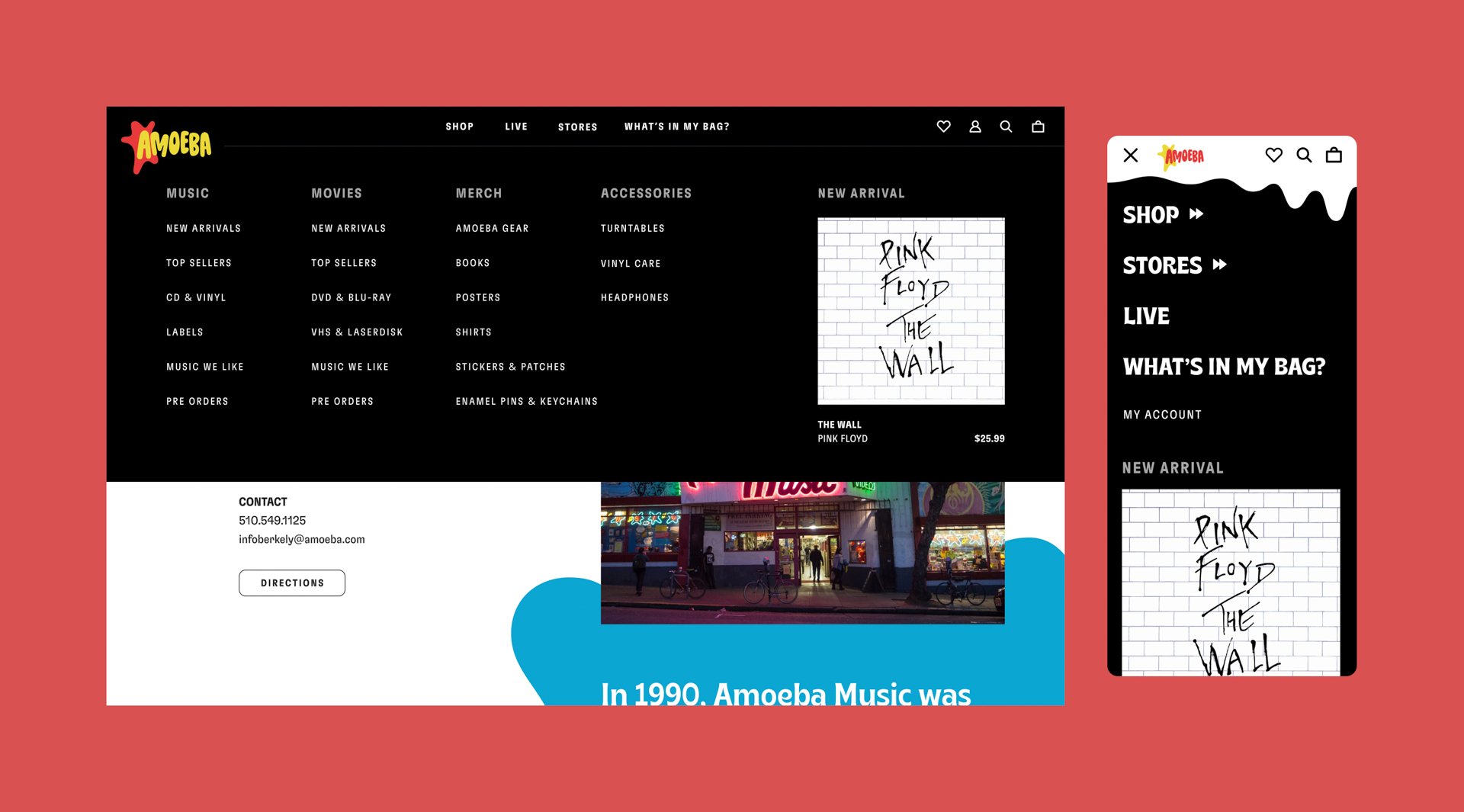
I redesigned the information architecture to organize the products into simpler recognizable groups. The navigation mega menus allow a better glance to browse products or discover information and events at the Amoeba stores. I prioritized the mobile experience to ensure it was intuitive and up to date. I created a more visually rich experience for the product list page. I organized the filters on the project list page for better genre browsing. I’ve added a wishlist for those devoted music fans. Each location has their own page to show off the unique vibe of the in-store experience.
Design Direction
Many ideas around the brand identity, logo, color, layout, and typography were all developed from the original iconic Amoeba logo. Using similar primary colors, and expanding the idea of paint drips and “amoeba” blobs for the brand pattern across the website. Finding typography with a little vintage personality but still contemporary. Elements in the layout have motion and change in scale to keep things interesting but elements still have order and function.

Homepage
Reduction was the main objective with making the homepage a more compelling and functional page for customers. The original homepage had so many sections that were not funneling customers to the checkout. The content was not tied well to new product releases. I took a simpler approach to this page and brought the products more to the forefront.

Product Detail Page
Product Detail Page
Showing off the beautiful album art and simple options to choose from between vinyl, cd, or cassette before the checkout experience. Adding items to the bag will pop up on the sidebar ready to checkout or help users save 10% by signing up for the Amoeba newsletter.
Navigation
-
![]()
Shop
-
![]()
Stores
-
![]()
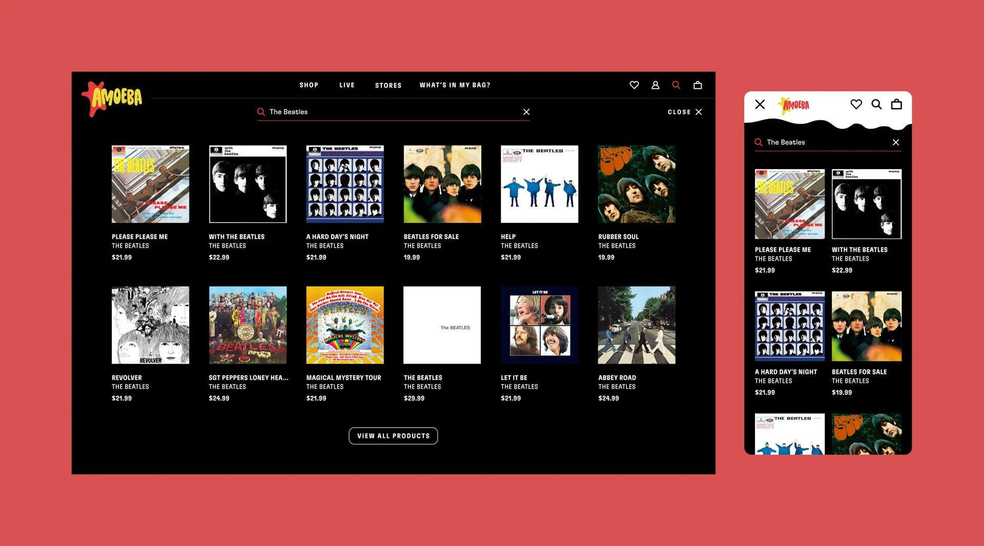
Search
-
![]()
Wish List


Navigation now organized and designed for efficiency now customers can discover products or find more information about the Amoeba stores.

Product List Page
Product List Page
With a massive product catalog it was important to include filters for all of the genres of music so the browsing experience would feel the same as perusing the aisles in the record shop.
Stores Page

Store Page
Every Amoeba location has it’s own vibe and characters who inhabit them I wanted to flesh out each location page further to show a sneak peak to excite first timers.
Results
This project started out of frustration but turned into a creative exercise to explore the possibilities of a customized experience could be. I crafted without a rushed timeline, budget restrictions, and prioritizes good user experience, best practices, and compelling visuals. It’s impressive to see how compelling a project can be without any restrictions.